Sony vs. Sigma - Sharpness Comparison
Marc Heijligers, 06-02-2016On this page you’ll find a detailed comparison between the sharpness of both lenses.
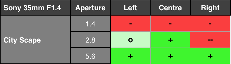
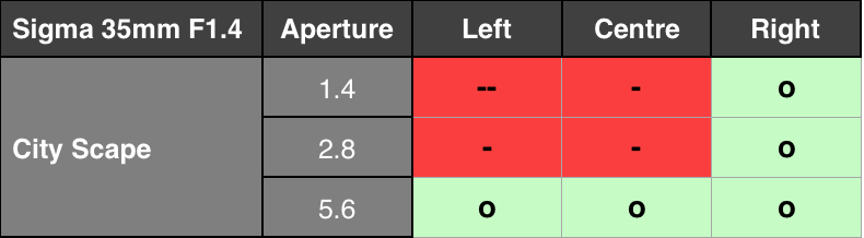
Summarized Results
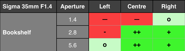
The tables below show the summarized relative performance of both lenses I have tested in terms of their sharpness. As you can see, the Sony is a bit sharper, but having a serious issue with a tilted lens element on the right side (also see the Sony Lens Quality issues page for more info).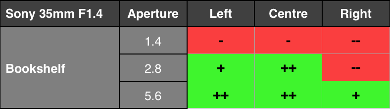
Test Conditions
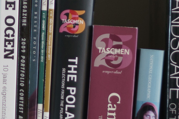
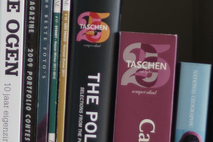
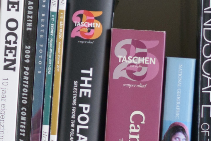
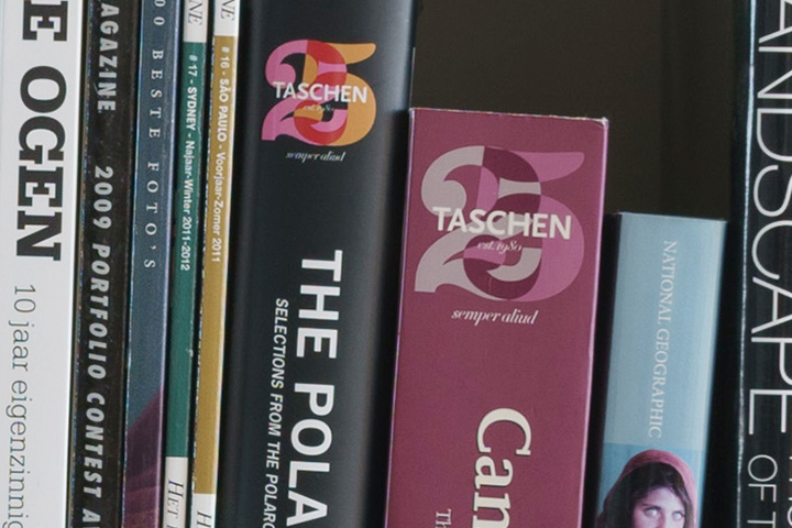
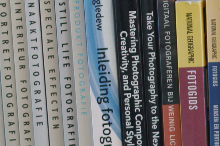
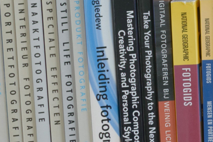
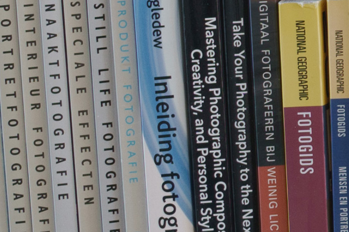
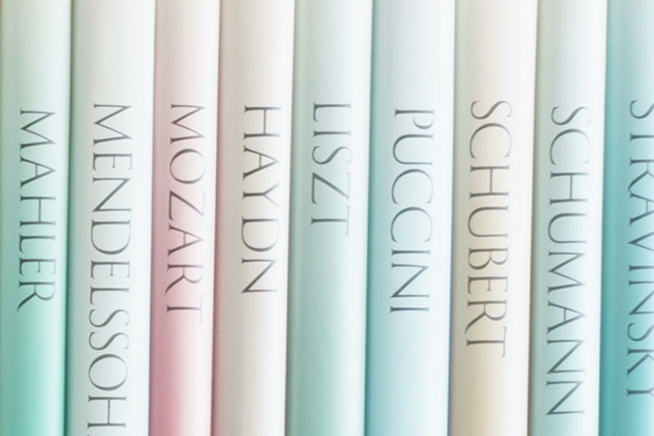
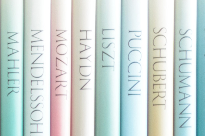
The Sony FE 35mm F1.4 is tested mounted on an A7RII, and the Sigma ART 35mm F1.4 mounted on a NIkon D800. The A7RII pictures have been scaled to the D800 resolution (from 42Mpix to 36MPix) to make them easily comparable. This gives a small resolution advantage to the Sony (about a 15%, which is far from a pixel), but the overall conclusions on sharpness have been checked, and are the same with the unscaled pictures (one example is added for you to check).The first test is to judge the field sharpness of the lens. For this I use a bookshelf, which has a flat surface and a lot of books where the text on the book spines can used to test the subjective sharpness at a distance of 1.5 to 2m (not fully scientific, but sufficient to represent practical use cases for most of us). The camera is put on a tripod, where care is taken that the camera is perpendicular to the bookshelf (using the level indicator of the camera, visually checking the camera is in the middle, the bookshelf plates are symmetrical in the viewfinder, and double check with LensCal that the book spines are within the DoF range). The focus point for all photos is always in the centre (though other focus points have been checked for sanity, as well as multiple pictures to exclude focus differences). For lenses with different focal length, the camera is moved such that the composition of the scene remains the same in the viewfinder. Photos have been made with Steadyshot turned OFF, Silent Shooting turned ON, and a timer (but the differences are hardly visible with complementary settings in this specific setup). Pictures are taken in RAW, and processed in Lightroom with the Camera Neutral setting, and with Lens corrections enabled. For sanity, I’ve checked the difference between JPG, and RAW with corrections turned off, but the results are similar. Three regions are considered in the tests, one in the centre, one at the bottom-left, and one at the top-right. To investigate color fringing, tests have also been done closer to some books that have a high level of contrast.
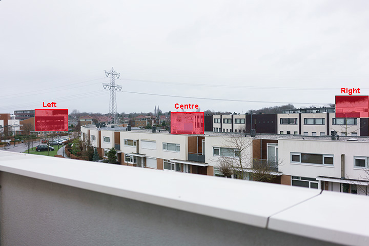
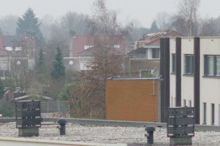
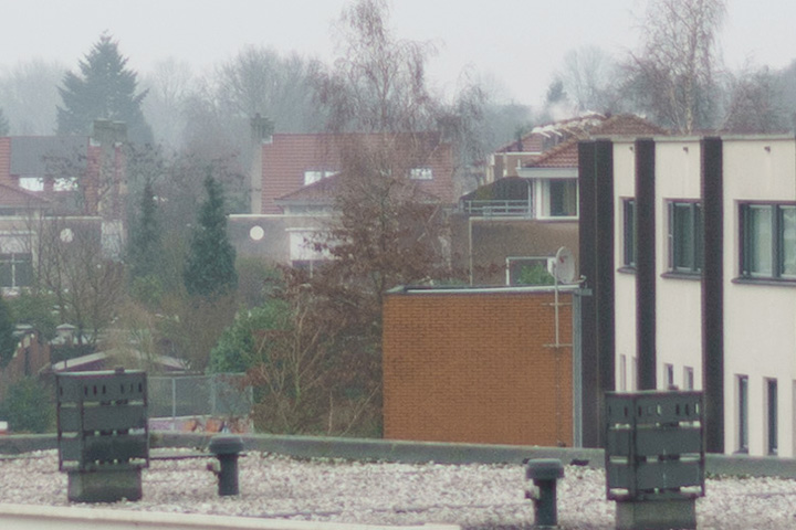
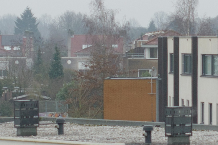
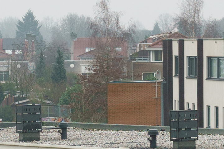
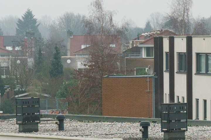
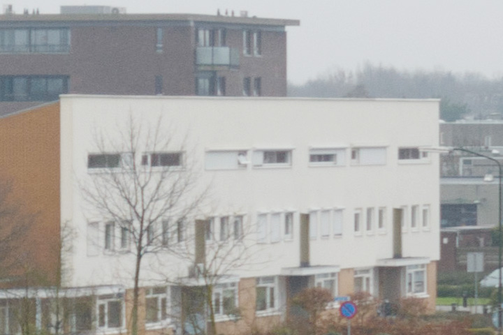
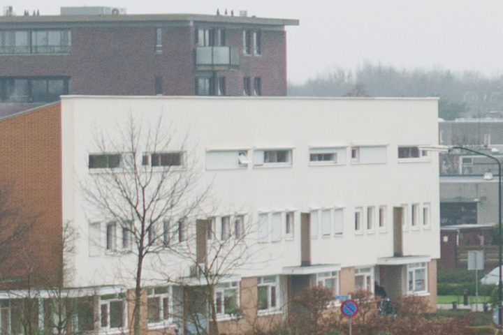
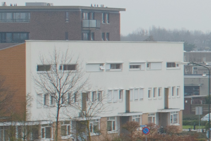
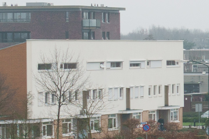
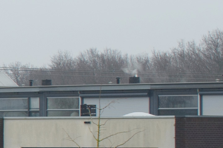
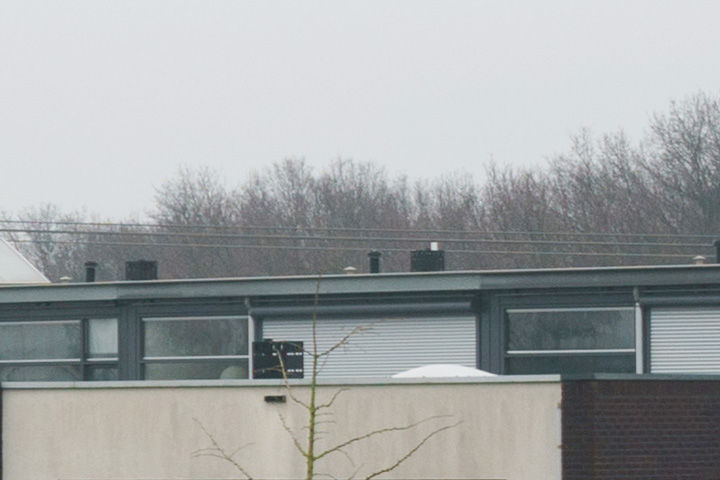
The second test is to test the lens for sharpness at further distance. For this purpose I photographed a (boring cloudy) city scene from the balcony. This rules out the problem with the camera might not be absolutely perpendicular to the bookshelf. Furthermore, the larger distance increases the depth-of-field for distant objects, hence if there are internal or shifted lens elements, it also reveals unsharpness in those conditions. Also here three regions are considered the centre, the left, and the right side.

Detailed Comparison
Use the filter button below to select which cases you want to see and compare in detail (the buttons will limit the selection), and use the slider to compare the Sony (on the left) and the Sigma (on the right).-
Bookshelf, Centre, f1.4 - Both lenses are soft at f1.4. There is some purple haze around the letters with the Sony, the letters with the Sigma are more “foggy”. The Sony is a bit sharper (white letters on Polaroid books show more haze on the Sigma).
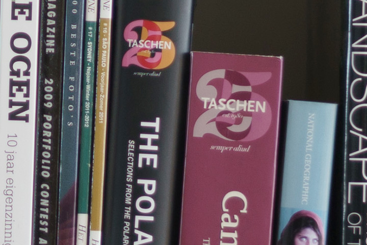
-
Bookshelf, Centre, f2.8 - Not so much difference in sharpness (there is a slight resolution advantage for the Sony at the expense of some chroma), and some differences in contrast curve and color temperature rendering of the cameras.
-
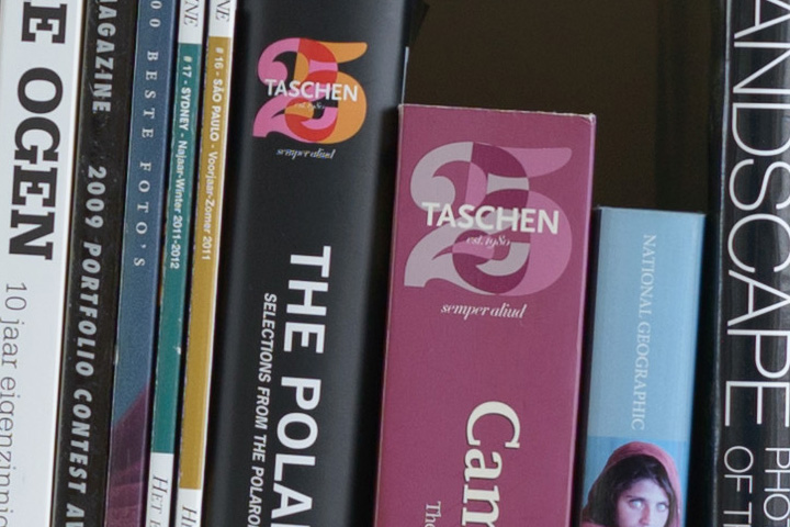
Bookshelf, Centre, f5.6 - No relevant difference in sharpness, besides some differences in camera resolution, contrast curve and color temperature.
-
Bookshelf, Left Side, f1.4 - The Sony is sharper - the Sigma is quite hazy around the letters.
-
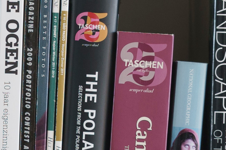
Bookshelf, Left Side, f2.8 - The Sony is sharper (resolution advantage?), contrast curve and color temperature of the cameras.
-
Bookshelf, Left Side, f5.6 - The Sony is still sharper, the Sigma shows haze around the white letters, but is acceptable.

-
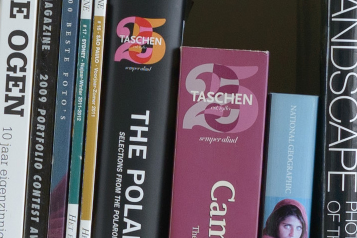
Bookshelf, Right Side, f1.4 - The Sony is very blurred, the letters have an echo, like the image is moved (it is not!). The Sigma is also not very sharp.


-
Bookshelf, Right Side, f2.8 - The Sony is still very blurred like at f1.4, the Sigma looks decently sharp


-
Bookshelf, Right Side, f5.6 - Both are sharp here, the Sigma a bit more contrasty.

-
City, Centre, f1.4 - The Sony is a tad sharper here (resolution advantage!), both lenses show purple fringing.
-
City, Centre, f2.8 - The Sony is sharper, and shows more contrast (camera profile).
-
City, Centre, f5.6 - The Sony is still sharper (especially see the brown wall).

-
City, Left, f1.4 - Like the centre of the frame, the Sony is a tad sharper here (resolution advantage!), although it shows some more purple fringing.

-
City, Left, f2.8 - The Sony is sharper, and shows more contrast (camera profile).

-
City, Left, f5.6 - The Sony is still sharper than the Sony.
-
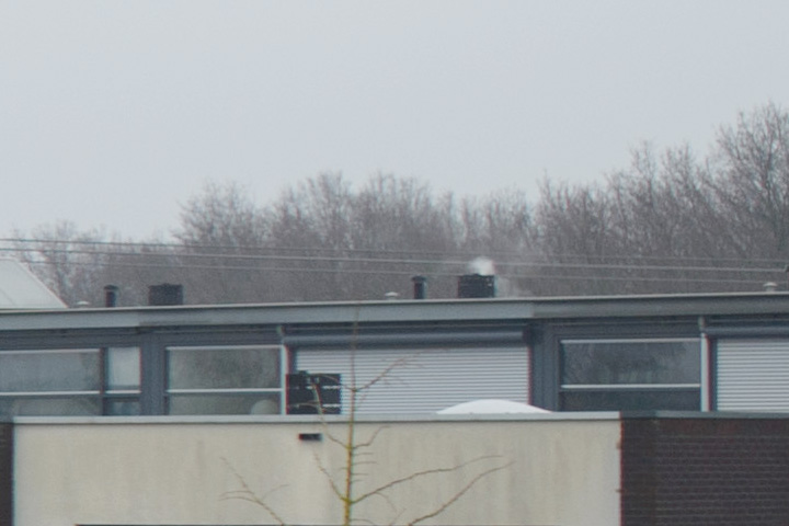
City, Right, f1.4 - The Sigma looks sharper, the Sony is blurred (look at the tweaks of the tree tops, rain pipe on the right has a green haze, the window shades show ragged boundaries).
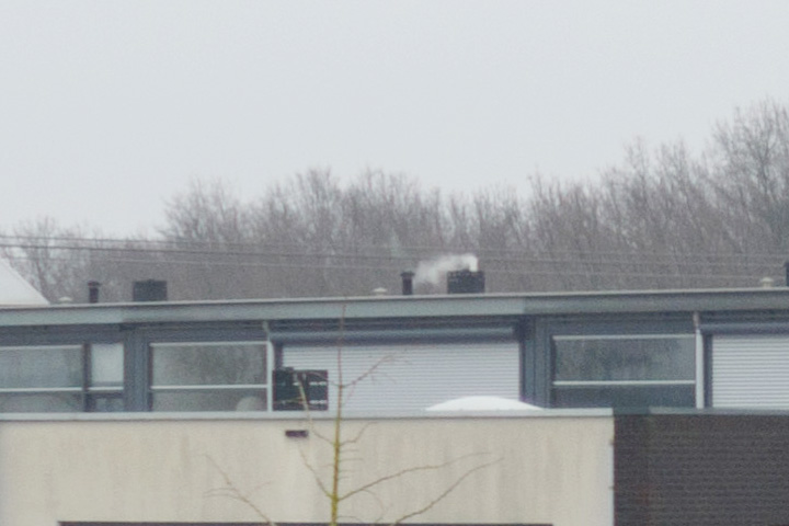
-
City, Right, f2.8 - The Sony is very unsharp, the window shades are very mushy. The Sigma suffers from some purple fringing.
-
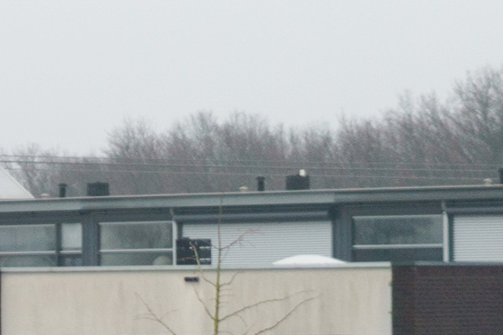
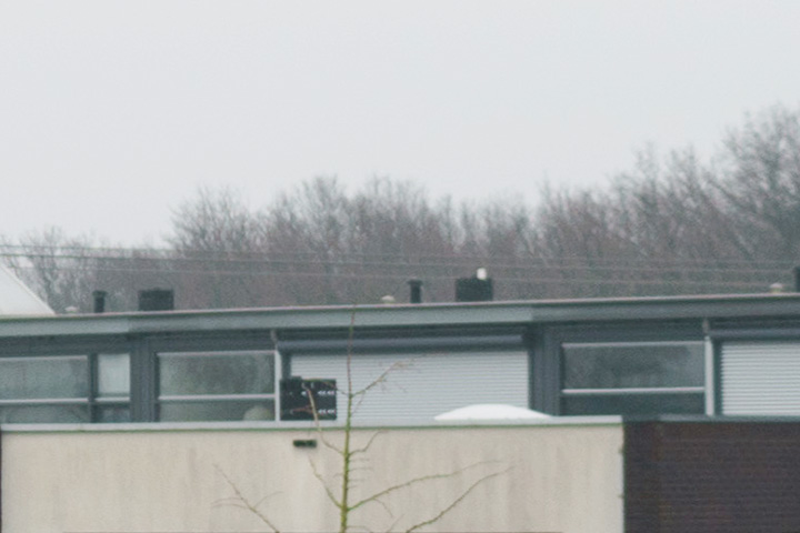
City, Right, f5.6 - The Sony is a bit sharper (tweaks).
-
Bookshelf Left, Sony 35mm, f1.4 versus f5.6

-
Bookshelf Right, Sony 35mm, f1.4 versus f5.6

-
Bookshelf Left, Sigma 35mm, f1.4 versus f5.6


-
Bookshelf Right, Sigma 35mm, f1.4 versus f5.6

-
Bookshelf Centre, Sony 35mm, f1.4 unscaled versus scaled - it shows the conclusions around sharpness are similar.