Sony 35mm F2.8
Marc Heijligers, 06-02-2016
The 35mm F2.8 is known for good sharpness overall, especially when stopped down. The first version I did have of this lens however did have quite some color fringing compared to the 28mm F2.0, which ringed a bell to me. I therefore tested another copy of the 35mm, which showed a better performance in some aspects (less color fringing, especially on further distances, and a bit more sharp in the middle, much sharper on the right), but also somewhat less in other aspects (a bit less sharp on the left side, less sharp in the bottom when close-by). Overall I preferred the second copy of the lens, so I’ve exchanged it. Nevertheless, for a lens of €799 one would expect more homogeneous performance.
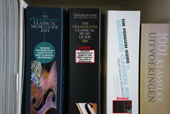
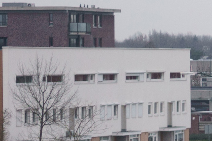
Bookshelf
For the bookshelf, in the centre both lenses are sharp (the old one a bit sharper than the new one, where the new one also shows some color fringing). The difference between the corners is huge, showing a huge problem with the first lens. For the bookshelf, I forgot to put the ISO fixed on ISO100, so the photos for the new lens are more grainy for f5.6, but the difference in sharpness is still obvious.
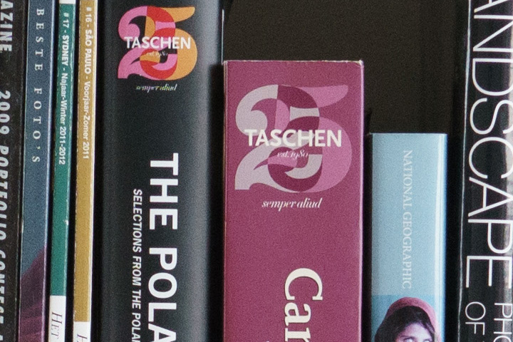
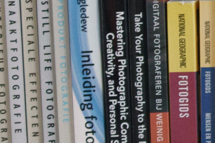
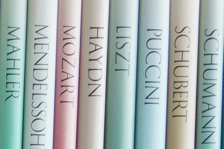
Bookspines
As the prime reason for investigation was the color fringing, I did some additional tests close-by on contrasty book-spines, to see the differences between the two lenses, and rule out focus variations. The crops are taken at the following parts of the picture (pixel peep alert!):
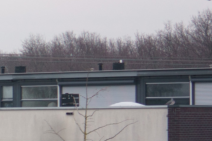
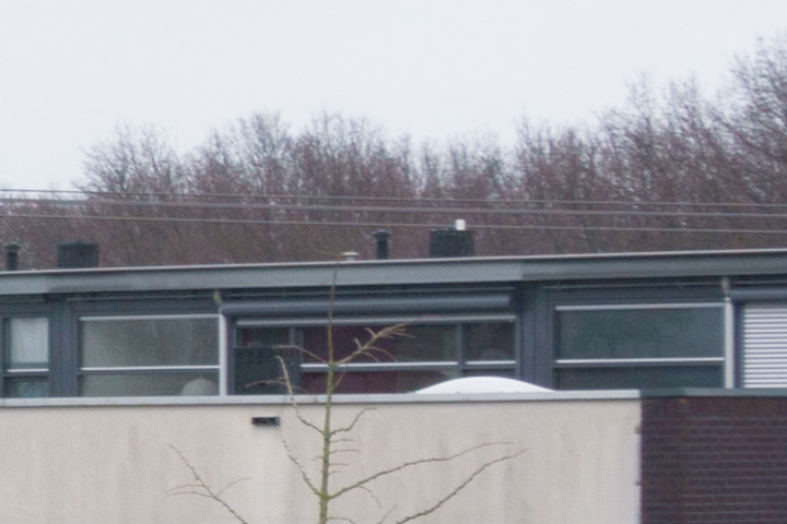
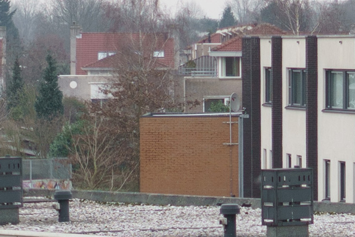
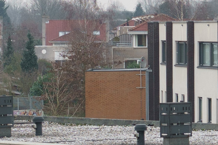
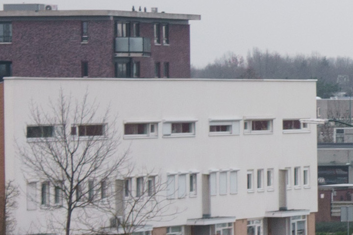
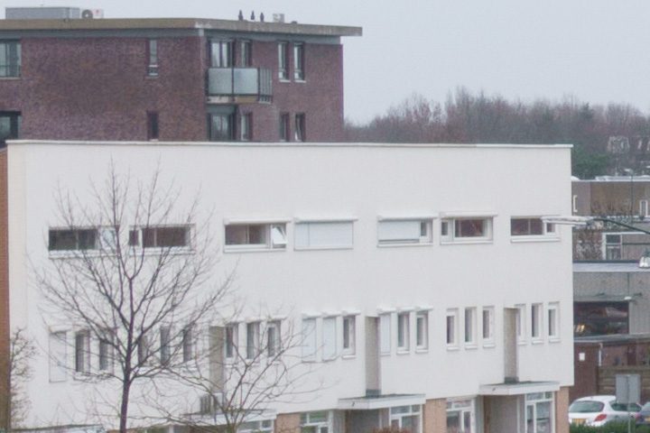
Cityscape
For the cityscape, in the centre both lenses are sharp, with the first lens a bit sharper in the middle (some variations due to different weather conditions for both cases, so you need to correct for the different contrast and color temperature). It is obvious that especially on the corners, the first lens is bad, and stays blurred at an aperture of 5.6 (and higher). There is obviously a problem with this lens.
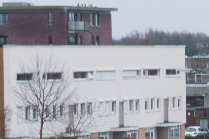
For the bookshelf, in the centre both lenses are sharp (the old one a bit sharper than the new one, where the new one also shows some color fringing). The difference between the corners is huge, showing a huge problem with the first lens. For the bookshelf, I forgot to put the ISO fixed on ISO100, so the photos for the new lens are more grainy for f5.6, but the difference in sharpness is still obvious.
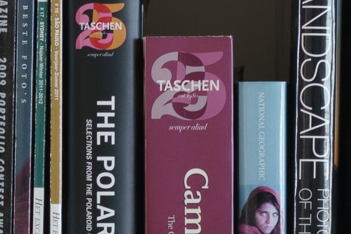
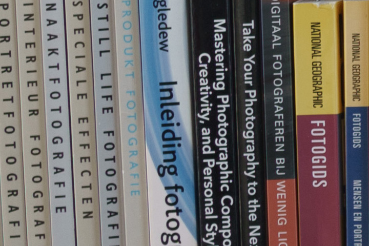
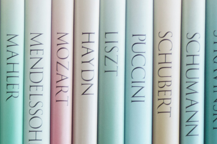
Bookspines
As the prime reason for investigation was the color fringing, I did some additional tests close-by on contrasty book-spines, to see the differences between the two lenses, and rule out focus variations. The crops are taken at the following parts of the picture (pixel peep alert!):
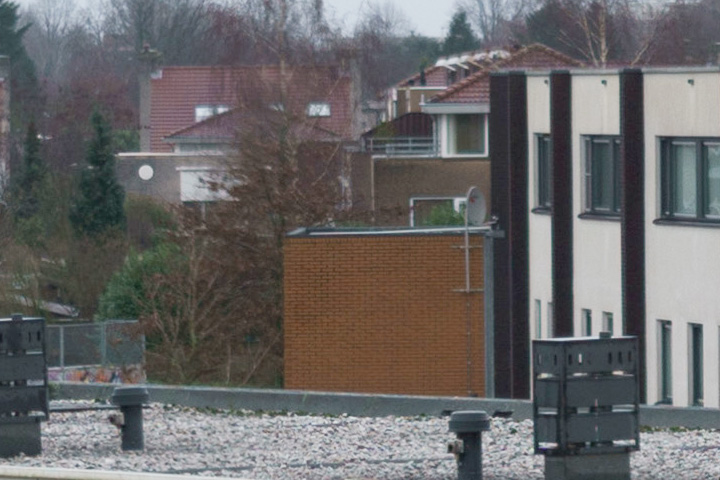
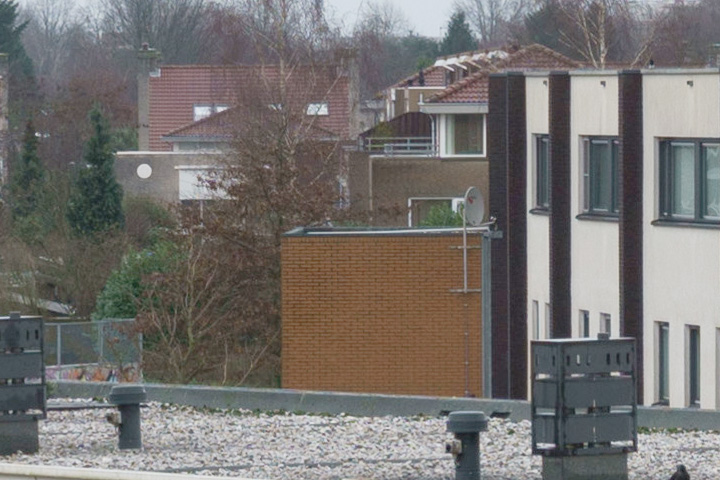
Cityscape
For the cityscape, in the centre both lenses are sharp, with the first lens a bit sharper in the middle (some variations due to different weather conditions for both cases, so you need to correct for the different contrast and color temperature). It is obvious that especially on the corners, the first lens is bad, and stays blurred at an aperture of 5.6 (and higher). There is obviously a problem with this lens.
Summary
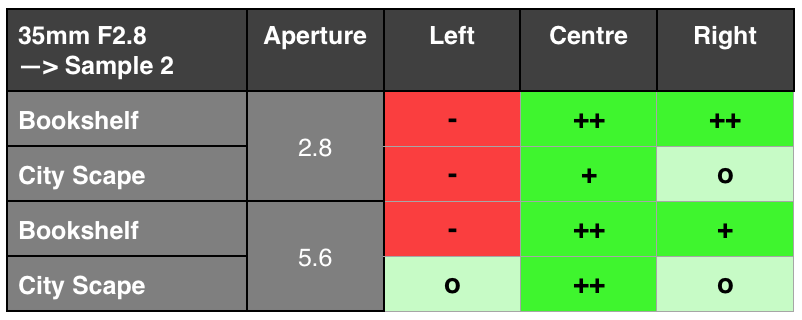
The two samples do differ a lot, with the first sample being a mixed bag and overall weaker on the right size, whereas the second sample is weaker on the left side. As the second sample shows a strong behavior in the centre, and better performance at further distances, I preferred that one. The results are summarizes in the tables below.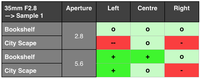
Detailed examples
Use the filter button below to select which cases you want to see and compare in detail (the buttons will limit the selection), and use the slider to compare the 2 lens samples.-
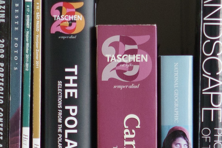
Centre @ f2.8 - Sample 2 is sharper, sample 1 has a white haze on top of the white letters:
-
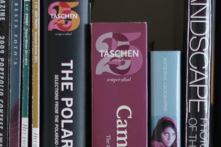
Centre @ f5.6 - Sample 1 has a hard to notice white halo, but it is still there.
-
Left-Bottom @ f2.8 - Sample 1 is sharper than sample 2:
-
Left-Bottom @ f5.6 - Compared to f2.8, sample 1 is equally sharper than sample 2:
-
Right-Top @ f2.8 - Sample 2 is sharper than sample 1 (which is the other way around on the left side):
-
Right-Top @ f5.6 - Compared to f2.8, sample 2 is equally sharper than sample 1 (which is the other way around on the left side):
-
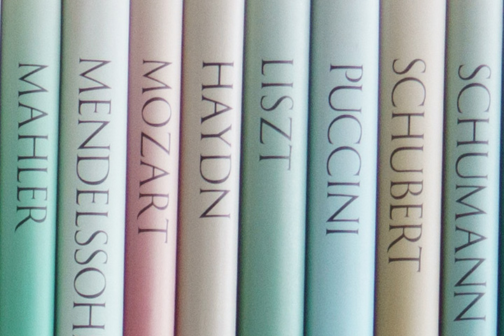
Centre @ f2.8 - Sample 1 has a lot of color fringing


-
Centre @ f5.6 - Sample 1 still has somze haze around the letters compared to sample 2, but way less color fringing than at f2.8:


-
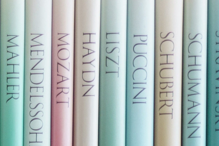
Bottom @ f2.8 - Sample 1 is much sharper than sample 2:


-
Bottom @ f5.6 - Sample 1 is much sharper than sample 2:


-
Centre @ f2.8 - Sample 1 has a purple haze around contrasty edges, sample 2 is also sharper:
-
Centre @ f5.6 - Not so much differences between the samples, besides the different conditions of weather:
-
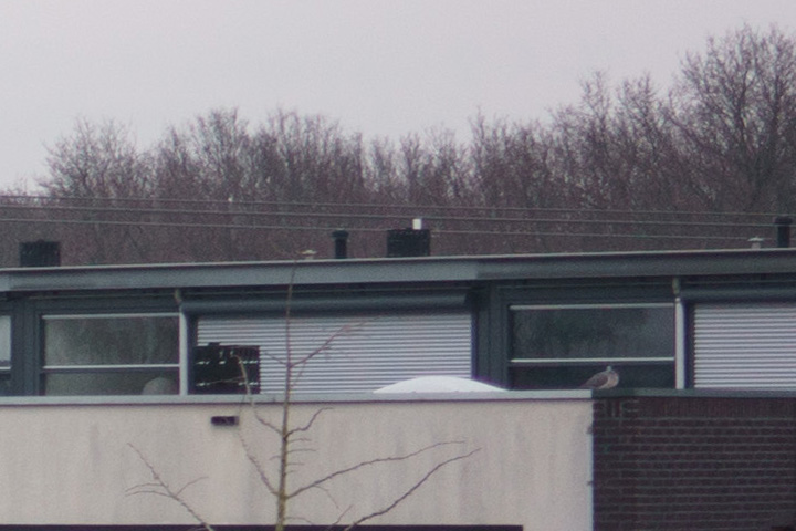
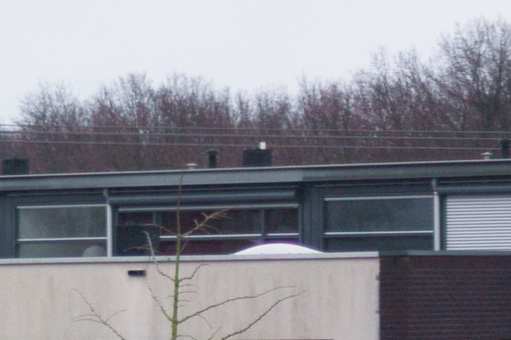
Left @ f2.8 - Sample 1 is a lot un-sharper than sample 2. As the centre and right side are sharp, camera movement can be excluded. For the bookshelf example the sharpness observation is reverse for sample 1 versus 2, which could imply that if we suspect skewed elements, the internal elements may rotate at different focus points:
-
Left @ f5.6 - Here sample 1 is a bit sharper (e.g. look at the logo on the aico on top of the brown building, or the tweaks of the trees at infinity):
-
Right @ f2.8 - Sample 1 shows a purple haze.
-
Right @ f5.6 - Sample 1 still has a haze at the sun-shades and a white halo on top of the skylight.